Portfolio section is your central hub for diving deep into your performance metrics. It allows you to navigate through your assets, review graphs, list transactions, and export your data.
Navigating the Dimensions
The Portfolio page is designed to encourage exploration. Instead of configuring disparate views, you navigate across multiple dimensions. Each dimension sets the context for the whole view. For example, once you select a period or metric, all parts of the view will use the same one.
Filter
Filters control which positions are included in the analysis. A filter runs before any number is computed, so the table, the charts and the totals all describe the same set of positions.
- This could be a top-level filter such as
Liquid assets(which excludes real estate, valuables, art, and ventures). Predefined filters, custom conditions, And/Or grouping and saved filters are covered in Filters. - You can navigate to a specific asset, account, or any other group by clicking its name in the table. You can go multiple levels deep (e.g., specific Account, Type, and Currency). To go up a level, click in the top bar. To see all positions within the opened group, click ↗ button in the top-right corner (e.g., to see all positions in a specific currency).
- Additionally, you can filter the table by typing above it. Input a word, and only positions, groups or transactions that match it will be included in the table, graph and summary. Want to match multiple different things? Use a comma (like "apple, microsoft"). To exclude a word, use an exclamation mark (like "etf !bond").
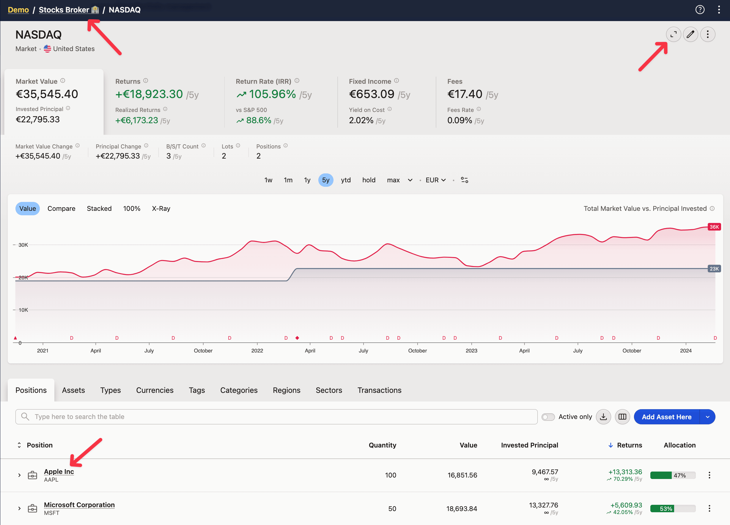
Filtering by typing filters the rows that you see, so if you search for "etf," it will work within Positions, Assets, and Types, as they all have the Asset type column. But it won't display any results in other groups as their rows don't contain that information.
Metric
The metric sets the context of the analysis, changing the available graphs and columns in the table. Each metric brings its own columns — Portfolio metrics reference defines what every one of them reports.
Currency
The currency all values will be converted into. Defaults to project currency.
You can use "Asset currency" to always switch to the currency of an asset you have navigated into. Outside of the asset, the project currency will be used instead.
Values are shown in one currency at a time so that positions can be aggregated and compared. A position, asset or lot cannot display a second "original" currency next to it, because one position can hold transactions in several currencies — there is no single original currency to show.
Two places do show both numbers at once: the Price column in the Transactions table displays the original value and the portfolio-currency value together, and the Taxes Due Report has optional Opening FX and FX Rate columns with the exact rate applied to each transaction. To compare a whole table across two currencies, export it in one currency, switch the currency, and export it again — then compare the two files (see export any table).
The Summary page is the exception: it always renders in the project's default currency, so an Asset currency selection applies only inside Portfolio views.
Date Period
The Date Period sets the last date (defaults to Today) and the preceding number of days to be included.
The period affects all the values that display the difference or ratio between the beginning and end of the period. Such values will be suffixed with the /period (eg. /1y). If you want to only see the totals, select the max period.
By clicking the period selector, you can pick one of the predefined periods, type in yours (eg. 2020 : 2023, 2020-06 : ytd, 2023-12), or choose a date range with a date-picker. Then, you can quickly compare year-to-year or period-to-period by jumping back and forth with +/-1 buttons.
Pinning periods. The period selector is a row of buttons — your pinned periods, plus whatever period is currently selected — next to a dropdown that lists every period and takes typed ranges. That is why the intervals on offer seem to shift from one moment to the next: a range you typed in sits in the row while it is selected and drops out as soon as you pick another. To keep one, open the dropdown and click the pin icon at the right of its row; a filled pin means pinned, and clicking it again unpins. The starting set is 1w, 1m, 1y, 5y, ytd and max. Pins are saved with the project and synced, so they follow you between Portfolio and Summary and onto your other devices, while each project keeps its own set.
On Summary, max and hold resolve against the filter selected there rather than against the whole project, so the same shortcode can cover a different range in the two views.
The date-picker widget itself is your browser's native one: the format it shows and the way it moves between years follow the browser and the operating system, not your Capitally formatting setting. See Settings and display preferences.
You can also select a date period directly on the graph, by dragging across the range you want. Everything follows the new period, including the benchmark comparison, which is always drawn over the period currently selected.
If you enable the Active only option above the table, positions that were empty or transactions that didn't take place during the selected period will be hidden. On the Transactions and Income Transactions tabs the same control is labelled Period only; it is one toggle sharing one setting, so switching it off on one tab switches it off on all of them. The toggle hides rows only — it does not change any metric; to exclude closed positions from the calculation itself, use a filter. A position counts as active if it was opened or closed within the period, or produced a return or a cost in it — so on max almost everything qualifies and the toggle looks like it does nothing. An asset you have just created and not yet given a transaction is hidden by it too.
Date period reference
Max and Hold both start on the day the first position was opened. Max always ends today, giving the full range from the earliest position to now. Hold ends today or on the last position's closing date, representing the actual holding period. Both deliberately include one day before that opening date, which gives returns a reference point and lets the performance chart start from zero.
Shortcodes. ytd is the current year to date, qtd the current quarter to date, -1q the rolling three months behind today, and 1y, 5y and similar are fixed lookbacks. There is no shortcode for the last complete calendar quarter or the last complete calendar year — type the start and end dates for those.
Typed ranges use inclusive boundaries. 2020 : 2025 covers six full calendar years, 2020-01-01 to 2025-12-31, not five — so divide a cumulative figure by six, not five, when checking it against an annual average.
Future periods project scheduled income — bond coupons as well as dividends — into every metric and chart. Type +1y, -1y +1y, max +1y, 2025, 2025 2030, or hold, which covers the whole holding period including future dates. See upcoming and estimated dividends for how those amounts are estimated.
With annualization on, every metric — benchmarks and economic indicators such as CPI and HICP included — reads as an average per-annum value and carries a p.a. marker. Switch to Over Period to see the cumulative change for the range instead; see annualizing rate of return.
Grouping
The Grouping dimension selects how positions and transactions will be grouped together in the table and graphs.
Charts
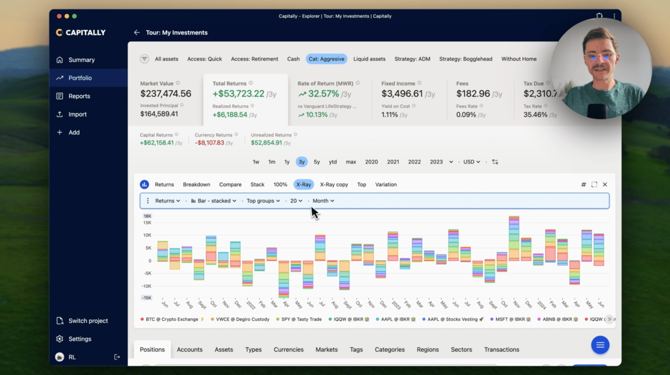
Charts depend on the Metric and Grouping dimensions. Metric controls what graphs will be available, while Grouping controls what groups will be compared.
There are multiple charts to choose from:
Comparecompares the metric across top 5 groups, with the rest rolled-up into "Others"Stackdoes the same, but stacks the groups on top of each other100%shows how metric allocation across groups changed over timeTopis like 100%, but shows only the totalX-Rayshows the value across all groups, including nested ones. Under the Rate of Return metric it plots percentage returns, which is the quickest way to compare positions of very different sizesHeatmapis similar to X-Ray, but the sizing of rectangles is based on the Average Invested Principal - meaning how much money you had invested in that position throughout the period. The metric is used to color the rectanglesVariationshows how metric varied across the top 20 groups over time. The size of the dots is again the Average Invested Principal
Editing charts
You can edit the built-in charts or add your own by clicking the Charts button. Click the three dots to save or update the preset.
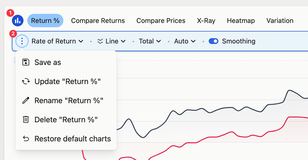
Choosing what appears on a chart
Compare and Stack plot the top 5 groups and roll the rest into "Others", and they take those five from the first five rows of the table — so the table controls the chart. Sort the table by the column you are comparing (Value, for allocation) to bring the items you want to the top, or narrow it with the search box above it: list symbols like AAPL, MSFT, or exclude with !etf. Once fewer than 5 rows remain, each one is drawn individually and the "Others" bucket disappears.
For a grouping the built-in dimensions don't cover — individual ETFs broken out while bonds and cash stay collapsed — use tags (one tag per item you want separate, broader tags for the rest) or nested categories (Equity/VWCE, Equity/SPYL, Bonds, Cash), then group the chart by tag or category. Untagged assets collect in their own group; filter the view down to the specific tags to keep it off the chart. To drop cash for good, filter Asset type to exclude Cash and save the filter together with the chart as a bookmark.
Seeing gradual changes in value
Market Value charts start at zero because a zero baseline is the honest scale for absolute amounts — auto-scaling turns a 0.4% move into a cliff and invites decisions the underlying change doesn't justify. When day-to-day movement is what you need to see, switch the metric to Returns, which measures relative change and is not affected by deposits and withdrawals. Or open Charts → Edit chart → set the metric to Value Change → Save, which plots the net change within the period while the total portfolio value stays visible in the summary tab above the chart. Every metric other than market value and price is already displayed as change within the period.
For month-end results without daily noise, take the Stack chart and switch it to Bar & Total mode. You get one bar per period showing the total return for that period, the view fund managers and services like Morningstar publish. Save the configuration to reuse it.
Finding what caused a spike
To identify the position behind an unexpected spike or drop, narrow the date period to a few days either side of it and compare positions on the chart — over a range that short, the one responsible stands out. A single-day event can also appear or disappear with chart width, because the resolution changes with the number of pixels available; the value is in the data either way.
Once you know the position, the cause is usually one of four:
- a missing sell, a duplicated buy or a wrong quantity — check the Transactions tab for that period
- a stale or missing price — Settings → Analysis →
Reset data and prices cachere-downloads market data - an exchange-rate glitch on a foreign-currency asset, which normally clears within a day
- an unrecorded stock split or other corporate action
Returns and charts look wrong covers each of these and how to fix them.
Hiding actual amounts for sharing
Two tools do this, with different reach. Hide my numbers, in the top-right corner menu, replaces every non-percentage value across the whole application with a tomato emoji and leaves percentages readable — use it for screenshots, screen recordings, live screen-sharing, or showing your portfolio to someone in person. The # icon above a chart affects that one chart only.
The # icon replaces the amounts on a chart with a percentage of the chart's absolute range. Capitally takes the range between the highest and the lowest value on the chart and expresses every value as a share of it — zero always stays at 0%, and negative values stay negative. On an allocation chart, where everything is positive, that means each segment is shown as a percentage of the largest one. On a chart that dips below zero — Rate of Return, for example — a span of -6.3% to 12.4% has an absolute range of 18.7 points, so 12.4% renders as 66.4% and -6.3% as -33.7%, which lets you compare the downside to the upside at a glance. This works on every chart type, including X-Ray.
Hide my numbers whenever anything beyond the chart image will be visible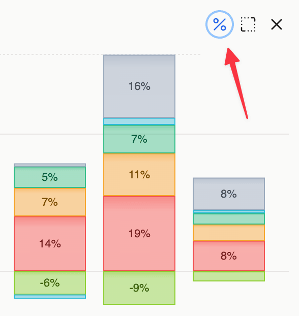
Sorting the Table
You can change the row order by clicking on the column headers or from the table view menu available above the table.
Some columns allow for special ordering modes apart from ascending and descending. Keep clicking the header to cycle through them:
- Absolute (⇟) - orders by the absolute value in descending order (rows with most impact are on top)
- Absolute period difference (±) - orders by the absolute difference in value between beginning and end of the period (rows with biggest change are on top)
- Absolute period ratio (%) - orders by the absolute rate of difference in value between beginning and end of the period (rows with biggest change are on top)
To rank positions by percentage return rather than by currency amount, sort the Returns column with Absolute period ratio (%): a 40% gain on a small position then outranks a 3% gain on a large one. The X-Ray chart under the Rate of Return metric shows the same comparison as a picture.
Configuring the table view
By clicking the columns button above the table you can configure it's looks.
You can make the rows denser, or choose which columns to display or not. Some columns are hidden by default — Annualized IRR (simple) among them — and Portfolio metrics reference explains what each one reports before you turn it on.
Whatever changes you make, they will only apply to the current view - metric, grouping and screen size. This lets you precisely control which columns you need on any particular view.
If you mess up, you can always reset the current view, or all view altogether.
Finally, you can make the same change across all views. For example if you want to see the "Returns" column everywhere - enable it on one view and click Apply changes everywhere.
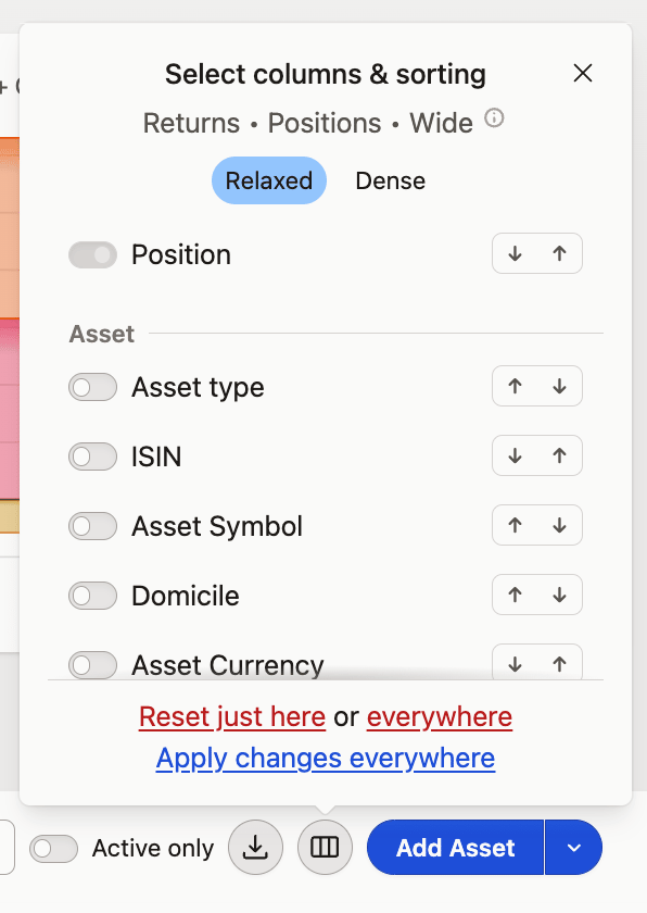
Columns resetting after every refresh
Column selections are kept in a functional cookie. If they reset when you refresh the page or restart the browser, enable Functional Cookies consent in your User Profile — see Settings and display preferences.
Totals and column sums
Excluding rows with the search box above the table hides them from view without recalculating anything, so the aggregations you see keep counting the rows you excluded. When a total has to reflect the exclusion, use a filter instead of the search box. Rates cannot be added up in any case — only simple values, such as amounts and quantities, can be summed across rows.
To total an arbitrary subset — every employer contribution, say — tag it: search the transactions by their notes, assign a tag to the matches in bulk, then group by that tag to see them together with their own aggregation. Your import template can set the same tag automatically from transaction attributes, so later imports arrive already tagged.
On mobile
On a phone the columns control is not the desktop columns button: tap the Position button above the positions list, on the right-hand side of the screen. From there you can toggle which columns are visible and choose which column to sort by. The layout differs from desktop, but the same column options are there.
Because preferences are scoped per screen size, your phone and your desktop keep separate column sets by design.
Finding a transaction
Transactions for assets you have sold are hidden by the Period only toggle above the table — the same control that reads Active only on every other tab — which is the usual reason a transaction looks like it has vanished. To find one:
- Open the
All assetsview. - Go to the Transactions tab and uncheck
Period only, so sold and closed positions are included. - Switch to the Assets tab and click the asset's name to scope the view to that asset.
- Return to the Transactions tab and sort by the first column (date) for chronological order.
Columns worth adding from the cog icon next to the table: Account, when the same asset sits in several accounts; Cashflow, for the all-in amount paid or received per transaction including fees and taxes; and Balance, for tracing a running cash balance when a broker figure doesn't match (finding the transaction that broke your balance covers that case).
Exporting Data
Anything you see in the table can be printed, exported to CSV, Excel, or copied to the clipboard. This allows you to take your data analysis outside of Capitally and use it in other applications or reports.
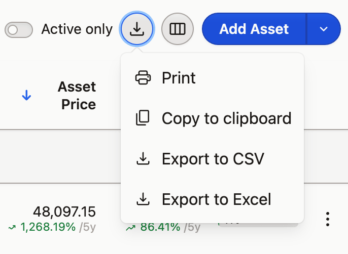
The exported data will be the same as what you see. It will include the same columns, order, rows (except group headers and totals).
You can expand or collapse rows to include more or less data.